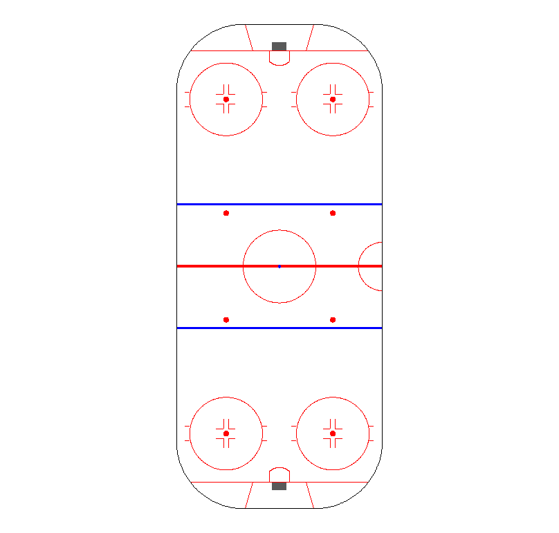
When I was working on projects several years ago, just getting started with R, one of the frustrations I had with trying to do hockey visualizations was that I couldn’t find an easy way to make hockey specific R plots. The rink markings were especially annoying to me, since there are so many and each one would need to be drawn on individually. I ended up creating a chart like this for faceoff locations.
As you can see, it’s fine, but the corners aren’t really right, I didn’t included creases or nets or faceoff dot markings or the trapezoids, etc., and I’m not sure It’s even really to scale.
So to that end, I’ve written a function for adding a more accurate NHL rink to a ggplot graph. It allows vertical or horizontal rinks and can limit the chart to the offensive or defensive zones if desired. The ggplot and ggforce libraries are required.
To use it, simply add it to a ggplot object like this
ggplot2::ggplot() + add_rink()
Vertical is the default, but a horizontal rink can be generated as follows:
ggplot2::ggplot() + add_rink("horizontal")
Offensive and defensive zones can be specified with a zones argument:
ggplot2::ggplot() + add_rink(zones = "off")
ggplot2::ggplot() + add_rink("horizontal", "def")
And that’s pretty much it! Code is available for download/copypasta on my github here.


